Overview
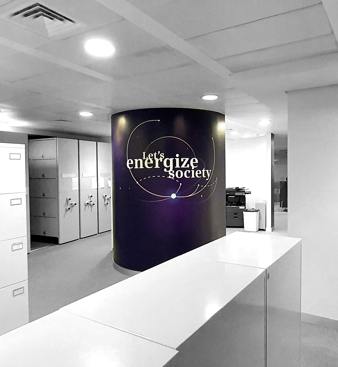
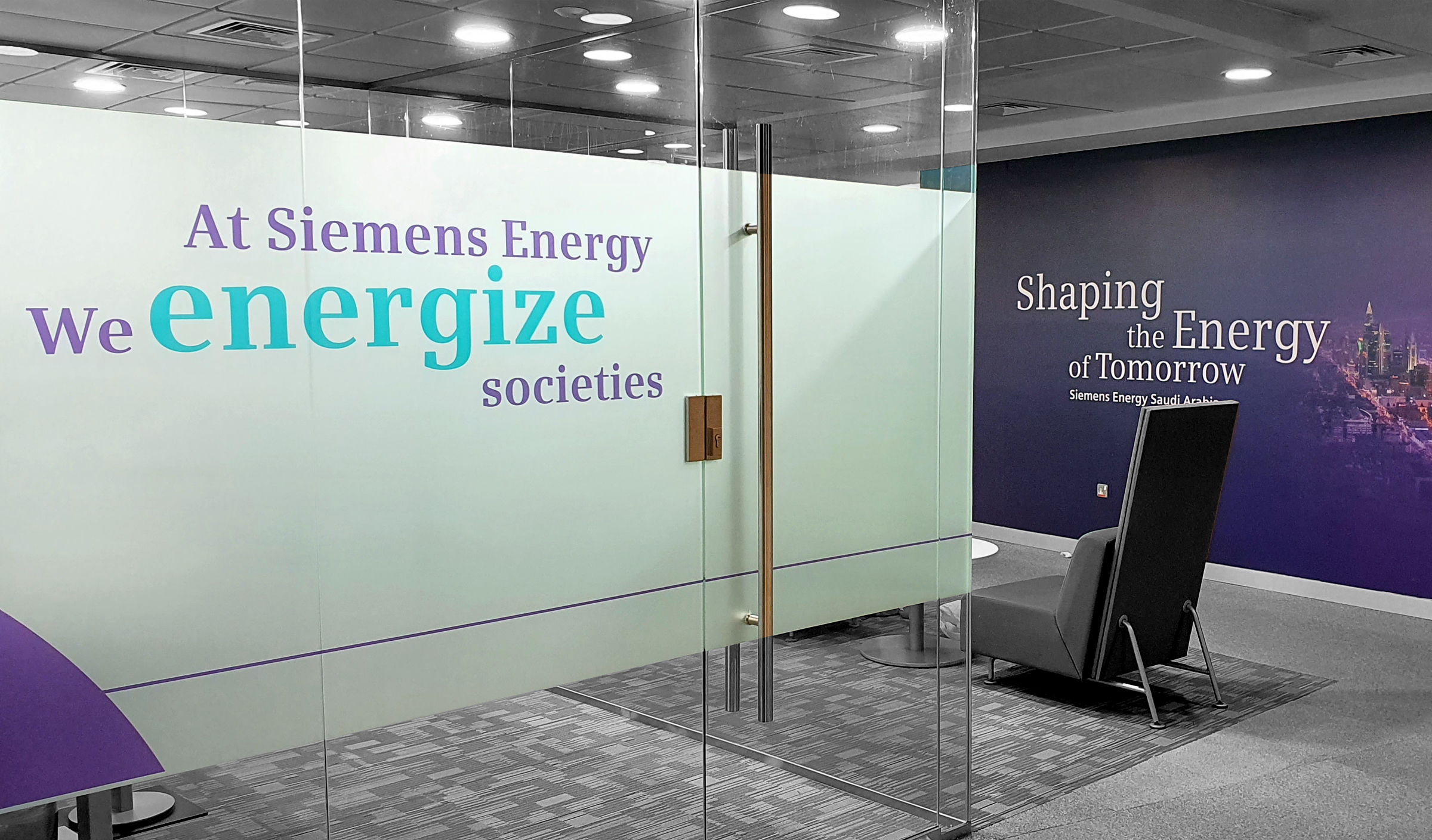
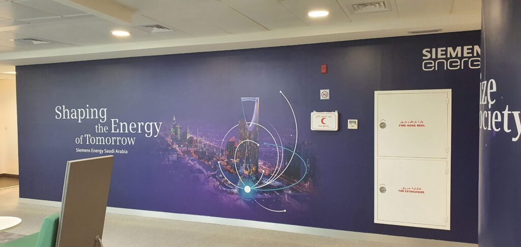
GrueBleen designed a robust, industrial logo, communicating established strength, stability and industrial credibility. The look was extended through collateral, signage, and a strong web presence. Petrol, green and grey communicated long-lasting stability and competence, revitalized by energetic optimism. Brand literature communicated the revival of existing prestige and competencies, broadcasting the message, within the company as well as outwardly to suppliers and clients.